The trend towards embracing custom graphics and the undeniable charm of hand-drawn typefaces. These elements are far more than mere decoration; they inject your brand with a dose of authenticity and an energised spirit, transforming your visual identity into something not just seen, but felt and remembered. It’s this blend of creativity and strategic branding that makes hand-drawn elements and custom graphics not just artistic choices, but powerful tools in crafting memorable brand identities.
The Power and Prestige of Hand-Drawn Typefaces in Elevating Brand Identity
In the quest for a standout brand identity, the allure of hand-drawn typefaces cannot be overstated. These bespoke elements do more than fill space; they weave the very fabric of a brand’s story, personality, and essence into a visual form that speaks directly to the heart of your audience. Let’s dive into why integrating custom, hand-drawn typefaces is not just a design choice but a strategic branding move that can set you apart in the digital world.
The Importance of Hand-Drawn Typefaces in Branding
- Personal Touch: There’s an inherent warmth and genuineness to hand-drawn typefaces that digital fonts simply can’t mimic. This authenticity forges a stronger, more personal connection with your audience, turning casual viewers into committed followers.
- Uniqueness: In a marketplace bustling with competition, a custom typeface acts as your brand’s signature, distinguishing you from the masses. It’s the declaration of your brand’s identity, proudly proclaiming, “This is who we are.”
- Versatility: The beauty of custom typefaces lies in their adaptability. Whether your brand dances on the lines of whimsy and playfulness or strides in the realms of sophistication and elegance, a hand-drawn typeface can be meticulously crafted to echo your brand’s voice and tone perfectly.
- Emotional Connection: Beyond aesthetics, hand-drawn typefaces tap into the emotional spectrum of your audience. They tell a story, evoke feelings, and create memorable experiences that embed your brand into the consciousness of your audience.
Through strategic design and thoughtful implementation of hand-drawn typefaces, brands can achieve a resonant and impactful presence that not only captures attention but also holds it, nurturing a lasting relationship with their audience. In a digital landscape cluttered with sameness, the decision to go bespoke with your typography is a powerful step towards carving out a niche for your brand, ensuring it not only stands out but also stands the test of time.
Incorporating such unique elements into your branding strategy requires a blend of creativity, precision, and a deep understanding of your brand’s core values and message. It’s a journey of transforming abstract ideas into tangible assets that resonate on a deeper level—a journey that turns your brand identity from being just seen to being felt and remembered.
To truly illustrate the art of custom branding, I thought I’d share with you some real-world examples from my portfolio. Each logo design and branding project you’re about to see was personally crafted by me {Maria} reflecting my commitment to bringing unique brand stories to life through the art of hand-drawn typefaces and custom branding designs. These case studies from AM Studio Créatif showcase not just the power of custom graphics but the personal touch and detailed thought process behind each distinctive brand identity.
Project 1:
BabyZen (BébéZen) baby massage classes that relax both children and parents
Brief Overview:
Anne has been passionately teaching baby massage for several years. When she wanted to expand her offerings by adding a new personalized package for new parents, with relaxation therapy for newborn babies with mums and dads who wanted to connect deeply with their newborns, she asked me to create a bespoke (hand-drawn) logo design for her business. Anne’s request was clear: to capture the gentle, enchanting spirit of her services in parenthood through a sophisticated, hand-drawn logo that mirrors the tenderness and magic of her approach.
Logo design for bébézen (BabyZen) by brand designer Maria Phieros, AM Studio Créatif featuring elegant, hand-drawn typography that blends creativity with sophistication, encapsulating the studio’s bespoke branding services
Crafting Anne’s Vision: From Concept to Brand Universe
In bringing Anne’s vision to life, our journey began with the creation of a bespoke logo that encapsulates the warmth, care, and magical essence of her expanded services. The process was a deep dive into understanding the subtle nuances of her practice, aiming to create a symbol that speaks directly to the hearts of new parents and their newborns. This custom logo wasn’t just about aesthetics; it was about weaving Anne’s passion and dedication into a visual form. We crafted an illustration that is both elegant and refined, paired with personalized typography that reflects the unique character of Anne’s services.
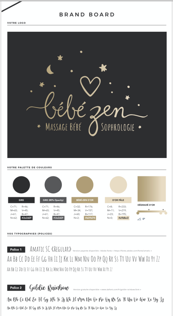
But our work didn’t stop at the logo. We embarked on designing a comprehensive Brand Board, which laid the foundation of her brand’s visual identity. This included a careful selection of typographies and her brand colors that resonate with the soothing and nurturing ethos of baby massage and relaxation therapy. The Brand Board serves as a visual compass, guiding every aspect of Anne’s brand universe, ensuring consistency and cohesiveness across all touchpoints. Through this holistic approach, we didn’t just design a logo; we brought an entire brand universe to life, enabling Anne to connect more deeply with families embarking on the journey of parenthood.
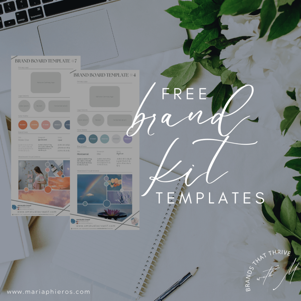
Want to design your own brand mood board? Get your free brand kit templates here.
The Impact: Transforming Brand Perception
The introduction of the custom typeface and the comprehensive brand identity for Anne’s service marked a significant turning point in how her brand was perceived by new and existing clients. The bespoke elements of her brand’s visual identity—captured through the harmony of the hand-drawn logo and the carefully curated brand board—resonates deeply with her audience. This resonance was not just about the aesthetic appeal but about how well the brand’s core values and the essence of care, connection, and tranquility were communicated.
Clients now associate Anne’s brand with professionalism, warmth, and a unique personal touch, setting her apart in a competitive market. The visual identity has also enhanced her online presence, attracting more families seeking meaningful connections in their new parenting journey.
Below you can watch a Timelapse Video of glimpses into our creative process.
This visual transformation, underpinned by a thoughtful strategy, has not only elevated Anne’s brand identity but has also expanded her market presence, proving the powerful impact of aligning brand visuals with the business’s core mission and values.
Project 2:
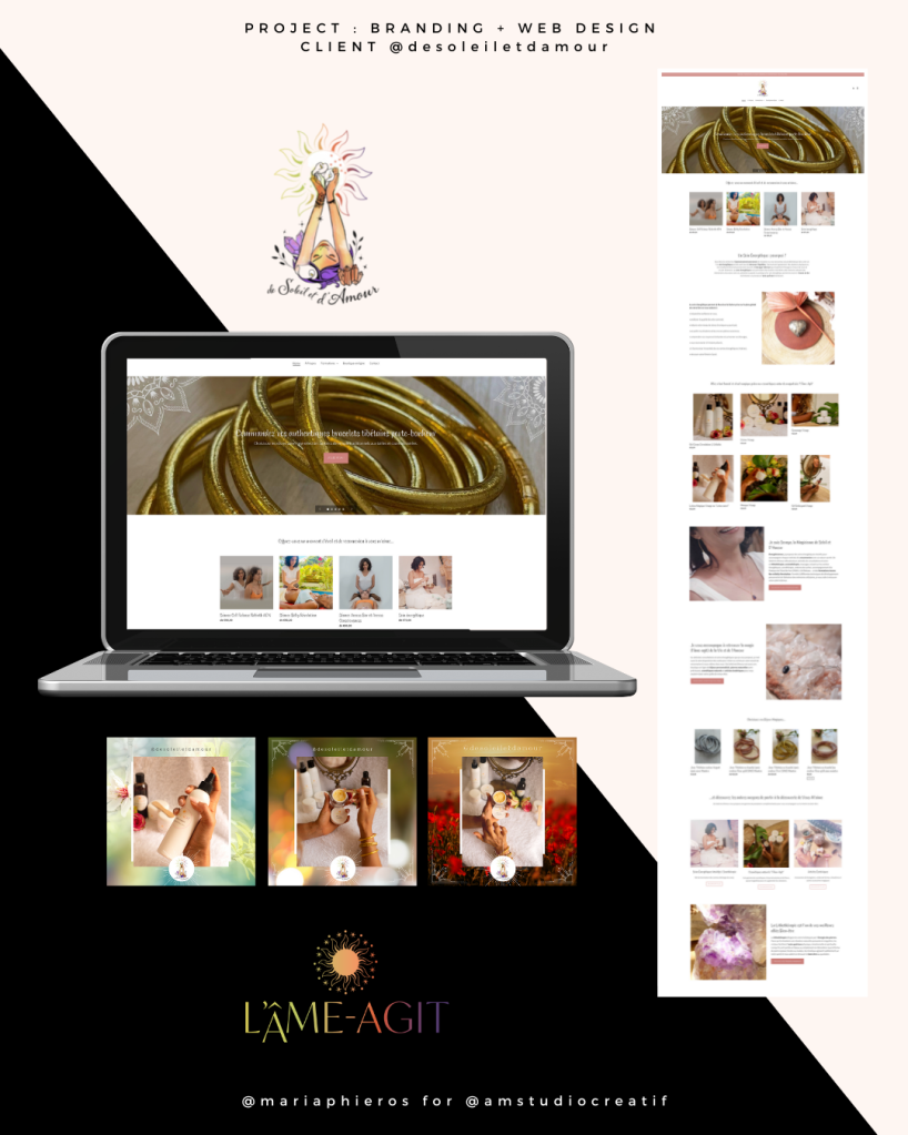
De Soleil et d’Amour (The “Sun and Love” Spiritual Coach)
Brief Overview:
“De Soleil et d’Amour” offers a sanctuary for those seeking spiritual coaching, crystal healing, and energy work. This project required a branding identity that could encapsulate the warmth of the sun and the love at the heart of Soraya’s services, reflecting the diversity and uniqueness of her offerings.
The Challenge:
The primary challenge was to visually communicate the brand’s essence—combining the spiritual warmth of the sun with the transformative power of love. The client also wanted to use herself as a model inside the logo, so I was tasked with the challenge of designing “her” inside this hand illustrated logo design; The brand needed a visual identity that could speak to the soulful connections it aimed to foster, resonating deeply with individuals seeking spiritual growth and healing. She wanted me to include symbolic elements which represented her and her business, the sun, the lilly, the growth of plants surrounding her and all showing a glow of positive energy and aura of crystals – all inside her logo.
My Approach:
Our creative journey kicked off with something a bit unconventional yet deeply authentic—a casual photoshoot. This wasn’t just about capturing images; it was about embedding the true essence of “De Soleil et d’Amour” into the logo itself. I believed that photographing the founder and artistically incorporating her likeness within the logo would anchor the brand’s identity in authenticity and personal connection. Surrounding her image, I integrated custom art elements—symbols that resonate with the spiritual and healing essence of her brand, crafting a hand-drawn logo that truly stands as the cornerstone of “De Soleil et d’Amour’s” identity.
Driven by the warmth and mission behind the brand’s name, we developed a custom typeface that embodies the warmth of the sun’s embrace and the welcoming nature of love. This typeface, alongside the bespoke graphics, was meticulously selected to mirror the brand’s voice: soft yet powerful, comforting yet transformative. Through detailed sketches and thoughtful iterations, our goal was to distill the brand’s spirit—its commitment to spiritual coaching, the vibrant energy of crystals, and the transformative power of love—into a visual form that speaks directly to the soul.
The Impact:
The introduction of a custom, hand-drawn logo and a cohesive visual identity across all her online presence and even in-store has significantly elevated “De Soleil et d’Amour’s” brand presence. The new logo and branding elements have been seamlessly integrated across their website, marketing materials, product labels, and packaging, enhancing the brand’s visibility and connection with its audience. Clients now instantly recognize the unique blend of spirituality and warmth that “De Soleil et d’Amour” offers, drawing them into a world where sun and love converge to guide their spiritual journey.
Beyond the Logo: A Visual Universe Unfolds
The impact of the custom graphics extends far beyond the logo, permeating every touchpoint of “Soleil et Amour’s” brand presence. From the website that welcomes visitors with open arms to the marketing materials that tell a story of love and connection, each element is infused with the distinctive charm of Anne’s brand.
• Website and Marketing Integration: The website acts as a digital haven for new parents, with custom graphics that consistently echo the brand’s core values across pages, providing a seamless user experience that is both informative and comforting.
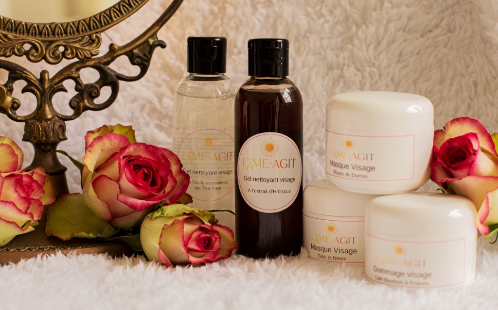
• Product Labels and Packaging: The bespoke aesthetic carries through to product labels and packaging, turning each product into a piece of Anne’s lovingly crafted universe. This attention to detail ensures that the brand’s essence is tangible, even in the smallest of touches.
• Physical and Digital Products: From beautifully designed informational brochures to online resources, every product Anne offers is a testament to the cohesive brand identity we developed together. These products not only serve their functional purpose but also strengthen the emotional bond between the brand and its audience.
The Result: A Brand Reimagined
The transformation of “Soleil et Amour” through these hand-drawn elements has redefined its market presence. It’s more than a visual makeover; it’s a strategic elevation of the brand that enhances its visibility, appeal, and connection with its audience. Soraya’s passion and dedication, once confined to the realm of her personal interactions, now radiate across all aspects of her business, inviting people into a world where care, love, and connection are paramount.

This rebranding has not only solidified the brand’s identity in the digital realm but also in the physical, through every touchpoint with clients. The bespoke branding approach has set “De Soleil et d’Amour” apart in a crowded market, creating a memorable identity that captures the heart of their mission and resonates with those on a path to healing and discovery.
Customer testimonial

Project 3: Katty Delgard
Brief Overview
Katty Delgard, renowned for her radiant approach to sophrology and personal development, embarked on a journey to launch her new business in Réunion, specializing in relaxation therapy. Tasked with capturing the essence of her practice, our studio set out to create a visual identity that encapsulates Katty’s philosophy of shining from within to present the best of oneself to the world.
The Challenge
The challenge lay in visually translating Katty’s sunny disposition and the transformative nature of her services into a brand identity. It was essential to convey themes of classic sophrology, personal rediscovery, joy, and solar energy, reflecting Katty’s approach to fostering serenity and reconnection to oneself.
My Approach
Inspired by Katty’s concept of “shine from within,” we designed a logo that radiates warmth and positivity, akin to the rejuvenating rays of the sun. This logo not only symbolizes Katty’s sunny and optimistic outlook but also her mission to illuminate the path for others in their personal development journey. Our team developed a comprehensive visual brand identity, including corporate brand guidelines and a Brand Board, featuring a validated logo, a harmonious color palette, and selected fonts & typography that resonate with themes of joy, serenity, and radiance. Tailor-made image processing further enriched Katty’s visual universe, ensuring a cohesive and vibrant brand presence.
The Impact
The culmination of our efforts in designing Katty Delgard’s logo and visual identity has significantly bolstered her brand’s market presence. By capturing the essence of “shine from within,” we’ve equipped Katty with a brand that perfectly reflects her ethos of personal growth and solar energy. The variations of her logo for print and web, alongside professionally designed business cards, have provided Katty with versatile tools to present her brand consistently across various platforms. As a result, Katty Delgard stands out as a beacon of joy, serenity, and personal reconnection, inviting clients to embark on a journey of self-discovery and development under her guidance.
Work with Me!
When you decide to work with me {Maria} and AM Studio Créatif, you’re getting more than a branding service; you’re entering into a partnership with someone who truly grasps the transformative power of custom, hand-drawn typefaces in storytelling. Here, it’s not about pushing designs out the door; it’s about taking the time to listen, to deeply understand your vision, and to meticulously craft an identity that not only resonates with your audience but also stands the test of time.
My commitment to your brand’s success is infused into every curve and line of the typefaces I create, ensuring that your brand does more than just stand out—it thrives in its unique essence.
Conclusion
In a world where digital spaces are crowded and every brand vies for attention, having a hand-drawn typeface could be what sets you apart—turning a scroll into a pause, a glance into a memory. Working with me, Maria, at AM Studio Créatif, you’re choosing to invest in the uniqueness of your brand, embracing the critical impact that a distinct identity has in establishing brands that not only survive but flourish online.
Let’s take this step together. Let’s craft an identity for your brand that’s not only memorable and distinct but as extraordinary as the vision behind your business.
Ready to make your brand unforgettable?
Contact me today, and let’s start the journey to crafting an identity that truly stands out. Your unique brand story deserves a unique voice, and together, we can make that happen.
Discover my journey
From creating launch campaigns and even winning some awards for my work for Google Play and Apple iTunes, South Africa, discover some brilliant brands I’ve had the joy or working with over the years.


Leave a comment